Planning a wedding is much like curating an art collection. It starts with inspiration, and evolves into a vision that‘s uniquely yours. But how do you sort through endless inspiration images to produce a cohesive color palette that reflects your style? At Idyllwild Event Design, we believe that your wedding should be as thoughtfully curated as a fine art gallery, where each color, texture, and detail contributes to the larger picture. So here it is: Your Wedding Color Palette: A Journey of Artistic Discovery
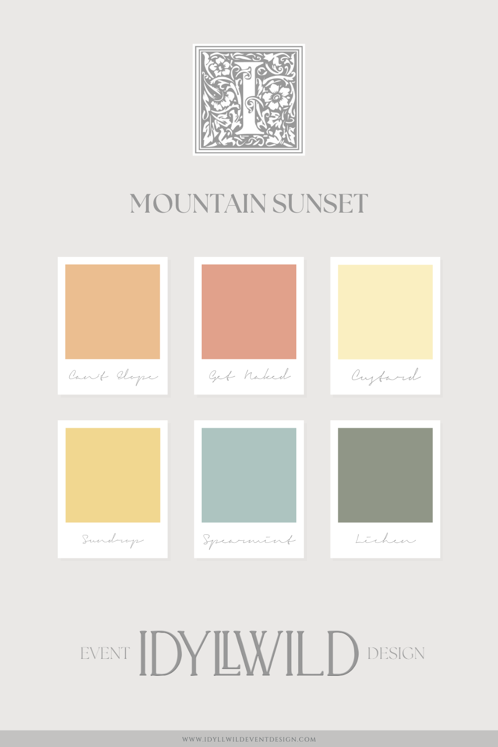
Step 1: Finding Inspiration Beyond the Wedding World
When you start thinking about your wedding color palette, it can be tempting to dive straight into Pinterest boards filled with wedding images. But here’s a tip: the most memorable weddings are those that draw inspiration from the broader world. Think about trips you’ve taken, art, fashion, music, and the everyday moments that bring you joy.
Idyllwild couples are generally artsy and observant. You understand the power of looking beyond the obvious. Imagine sourcing your color palette from the warm hues of a sunset in Tuscany or the soft tones of a Monet painting. These choices will make your wedding feel truly personal, like a living portrait of your life together.
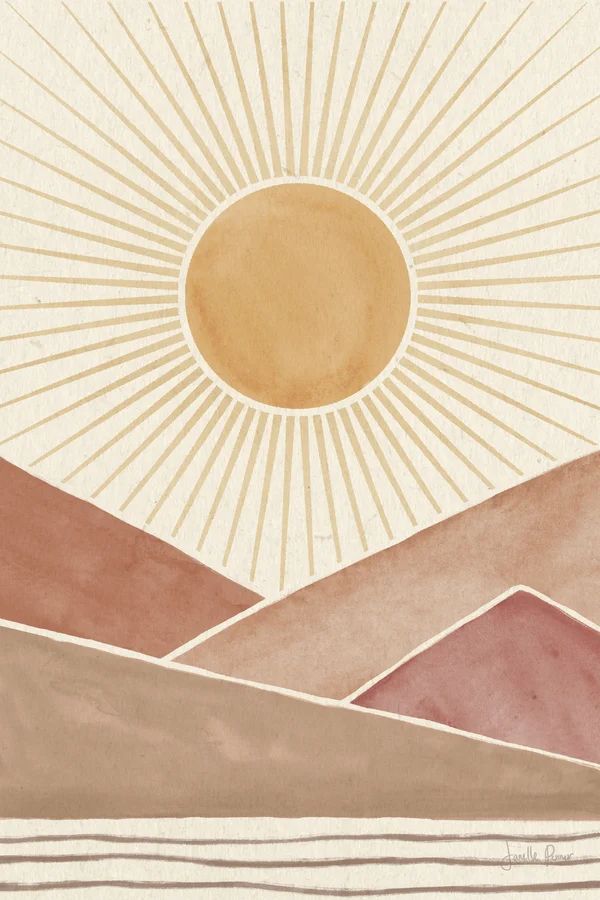
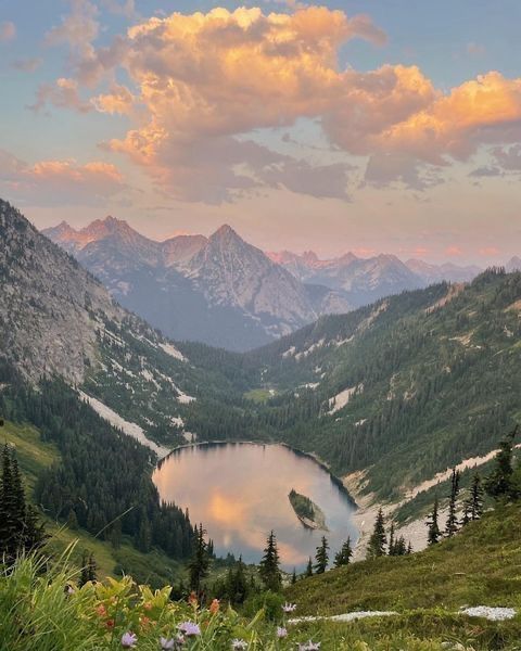
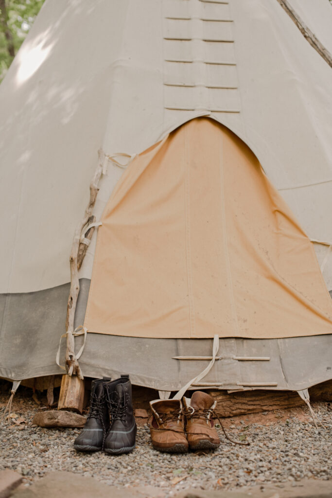
Step 2: The Fine Art of Editing
As you gather images that speak to you, remember that the key to a harmonious palette is in the editing process. Start broad—collect images that resonate with you on an emotional level, even if they seem unrelated. Then, begin the refinement process. Much as you would if you were curating an art exhibition, remove anything that doesn’t align with your emerging vision. What you’re left with will be a distilled version of your dream, the perfect foundation for your wedding design.
Step 3: Identifying Your North Star
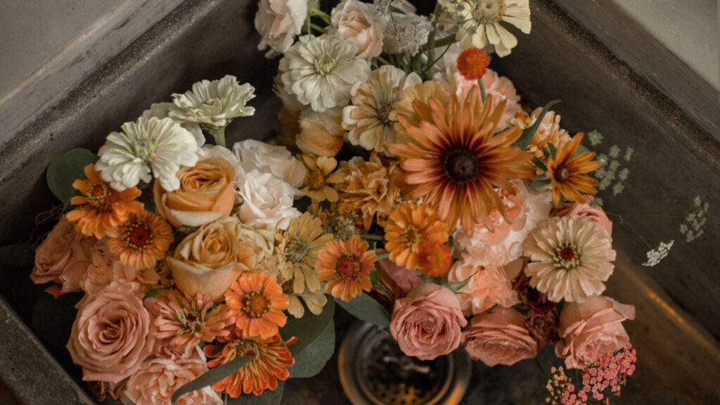
Amongst the remaining inspiration, there’s always that one image, a cornerstone of clarity, where everything comes together. It’s the image that captures the mood, the color, the texture—it speaks to you in a way that nothing else does. This image becomes your North Star, guiding the aesthetic decisions you make from this point forward. At Idyllwild, we’ve perfected the art of helping our clients find their North Star, ensuring that every detail aligns with this central vision, creating a wedding that feels as cohesive as it is beautiful.
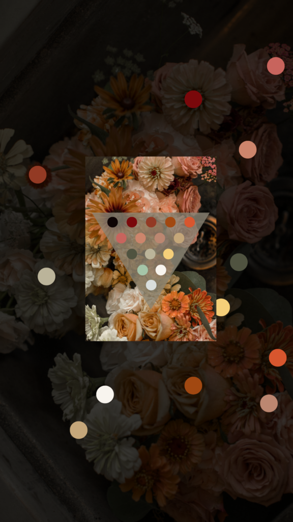
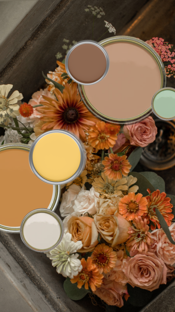
Step 4: Let’s Pull Those Colors!
- Balance Focal and Accent Colors: Play around with the proportions of each color to find the perfect balance.
- Add Supporting Tones: Choose a few additional shades that complement the key colors. They don’t need to come directly from your image. This adds depth and interest to your palette.
- Choose a Neutral: Unless you’re going for full maximalism (if so, really go for it!), you’re going to want to choose from a white, black, or gray color for incidentals that aren’t in your palette. If your palette leans warm, consider ivory or brown as neutrals.
- Pro tip: If you’re having an outdoor wedding in NY, green is likely a part of your wedding color palette, whether you like it or not. Plan for this!
Do Your Color Choices Match Your Vibe?
Sometimes we pull colors because we love them, but they just don’t convey the “feel” we want for our event. Whether it’s out of season, too moody, too juvenile, or you just don’t like the way it looks with your other stuff, don’t be scared to toss it!
Weaving Your Color Palette Throughout the Wedding Day
A practical piece of advice on this: Your photographer is snapping hundreds of pics in every area, all day long. The more cohesive your color choices, and the more you spread them around, the more pulled together your wedding gallery will look. We wrote a whole blog post about how to do this, but here’s a quick-and-dirty list of places to bring in those carefully selected colors:
- Invites and Day-of Stationery
- Signage
- Ceremony Decor
- Attire
- Floral
- Reception Details
- Lounges
- Signage
- Food and Drink
- Cake!
- Guest Experiences
- Favors and Send-offs
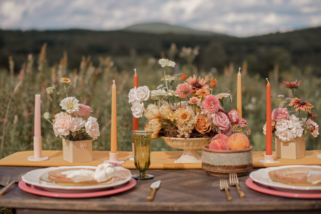
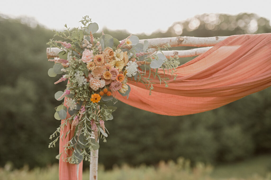
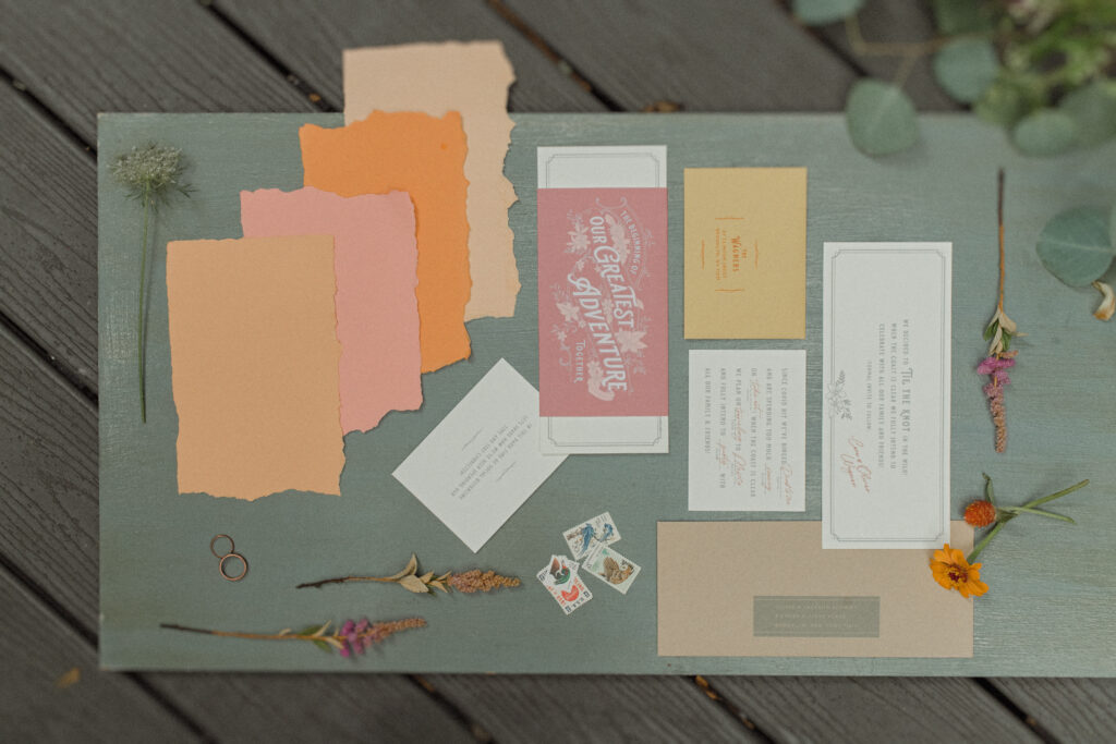
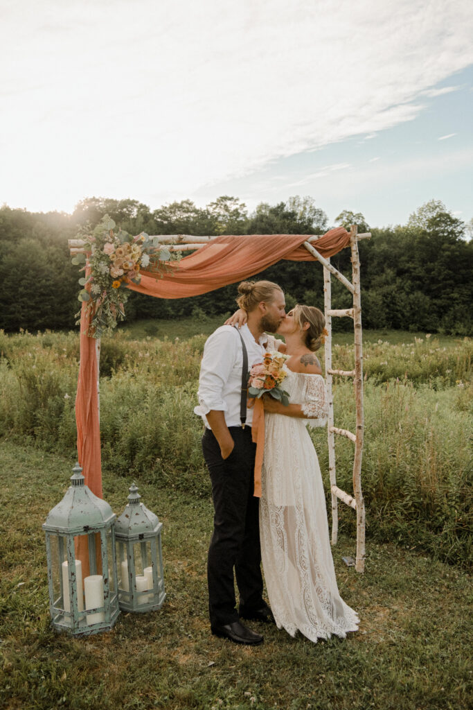
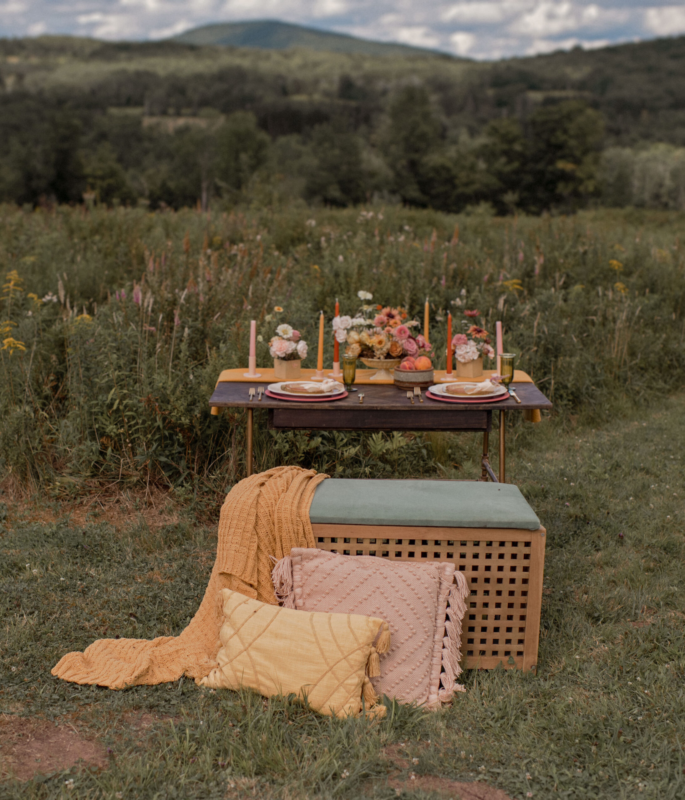
It will be so. much. easier. to bang out this list of planning tasks if you have your wedding color palette selected in advance. And when the products start rolling in, your story will unfold before your eyes. It’ll be cohesive and beautiful, and you’ll react with excitement rather than overwhelm.
It’s Okay to Ask for Help
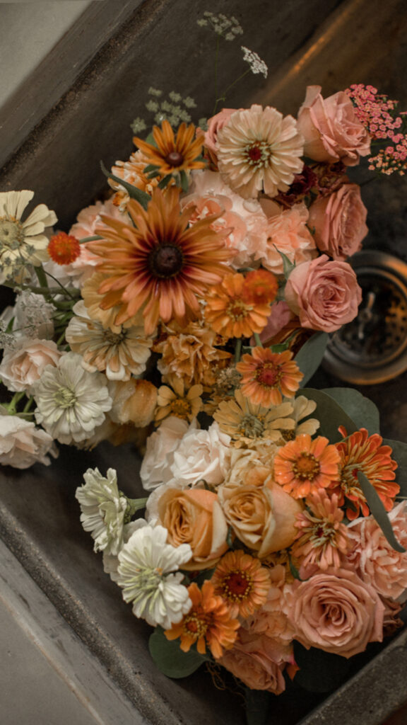
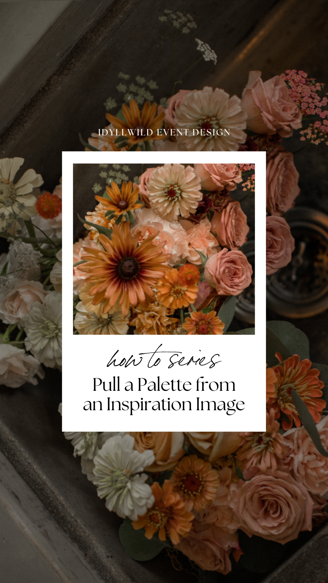
Now, don’t freak if you’re not a natural Bob Ross. The process outlined here is an oversimplification. All this work is done by Idyllwild, behind the scenes, in collaboration with your creative team. In fact, we pulled all of the mood and color for this photo shoot from one inspiration image:
Incorporating Your Values
We know that your wedding is more than just an event; it’s a work of art, an expression of your unique taste and style. At Idyllwild, we specialize in translating complex artistic visions into reality. We’re skilled in taking your inspiration and expanding it into a fully realized event that tells your story in detail. We also understand the importance of sustainability and community- values that we share with you. And just like you, we believe in the power of a well-curated experience.
Summing Up
So, if the idea of pulling together a wedding color palette and weaving it throughout your day feels overwhelming, or if you’re worried that your vision might be too complex for a standard wedding planner to execute, reach out to us. We live for this kind of creative challenge. Together, we’ll create a wedding that not only meets but exceeds your expectations—a celebration as unique and artistic as the life you and your partner are building together.
Did you come here from IG? You might just be a visual learner. Check out our zillions of Pinterest boards for more inspiration!
I’d like to thank the following vendors for sharing their talents for this shoot:
- Images: DAG Photography
- Venue: Bellfire Farm in the Catskills
- Beauty: Alessarro Beauty
- Invitation Suite: Of Good Stock
- Floral and Event Design: Idyllwild Event Design
Comments +